One map, two readings: when AI models get dropped into the World Values Survey
The Economist dropped two dozen AI models onto a cultural map, seemingly proving beyond doubt that AI culture is converging into one. But look at the same map at a different scale and the conclusion flips—the homogenization is real, it's just hiding in the wrong place.
The Economist recently ran a chart with a deliberately wicked headline: "Godless hippies"—Godless hippies. The premise is simple: take two dozen mainstream AI models, drop them onto the Inglehart–Welzel cultural map that sociologists have used for forty years, and see where they land.
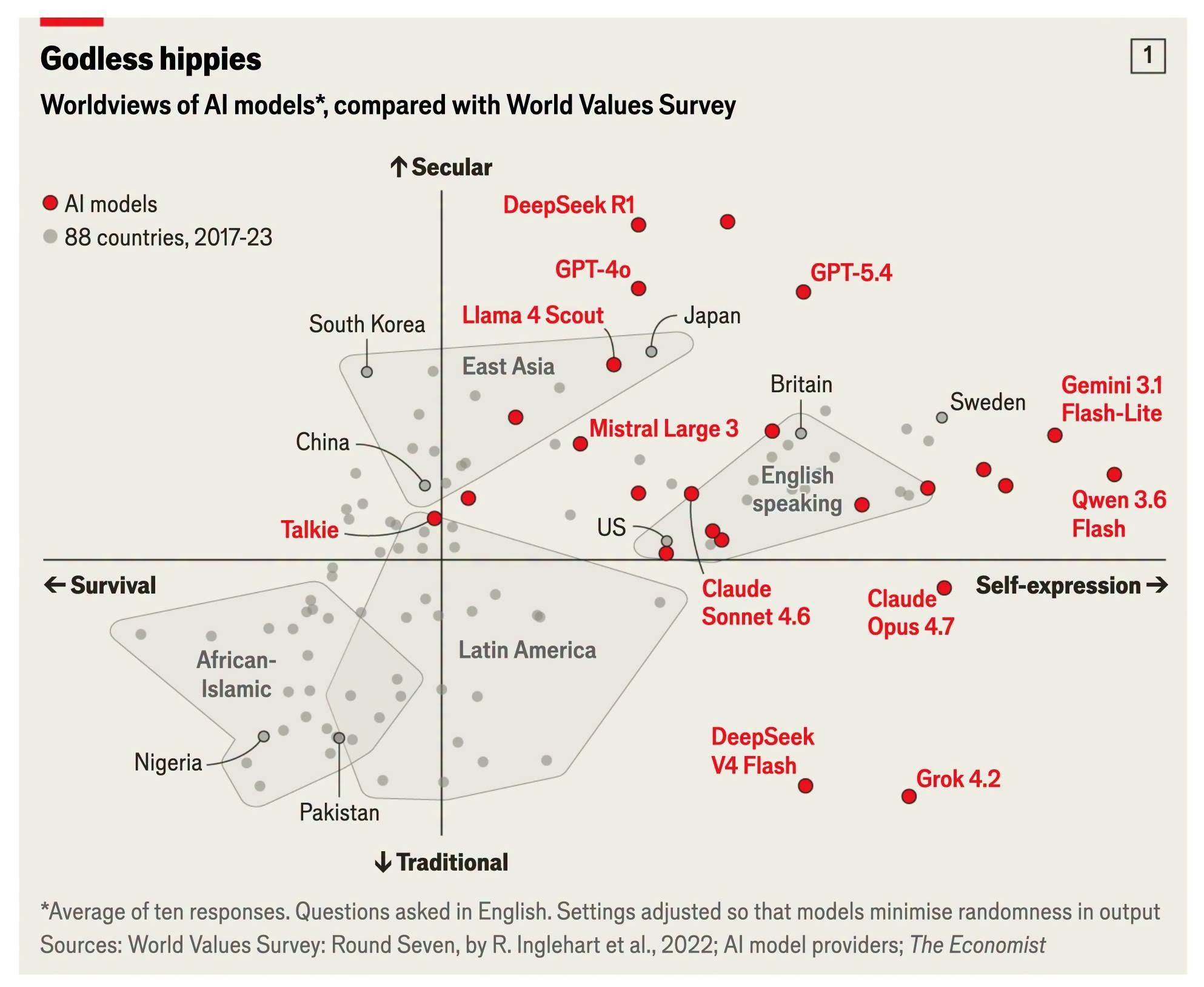
You've probably seen this map before. The horizontal axis is "survival vs. self-expression," the vertical axis is "traditional vs. secular." Sociologists use it to arrange more than a hundred countries onto a single two-dimensional plane: the African–Islamic world sits in the lower left (survival-oriented, tradition-oriented), the Nordic countries in the upper right (self-expression, secular), while Taiwan, Japan, and South Korea cluster in the East Asian zone that is fairly secular but not yet so self-expressive. It's a distillation of forty years of World Values Survey data—one of the few tools in social science that can genuinely "draw a culture as a single point."
Now two dozen AI models have been drawn as points too—red ones, layered on top of the 88 grey countries.
This chart admits at least two readings, and the two happen to be at war with each other—which is exactly what makes it interesting.
Reading one: cultural homogenization, proven beyond doubt
The first reading is the one that's most mainstream right now, and the easiest to turn into a polemic.
Look at that cluster of red dots—nearly all of them packed into the upper right. DeepSeek R1, GPT-4o, GPT-5.4, Llama 4 Scout, floating at the very top of the map—more secular thanany real country on the chart. Gemini 3.1 Flash-Lite and Qwen 3.6 Flash push to the far right, further right than Sweden, which is to say they emphasize self-expression even more than the most self-expression-oriented society on Earth.
The grey dot labeled US sits to thelower leftof the whole cluster of models. In other words, these models—including ones built by American companies—are more secular and more self-expressive than Americans themselves.
If you've read LostAbaddon's essay "Cultural Homogenization and False Diversity in the AI Era," this chart works as its illustration. That essay talks about "WEIRD bias"—Western, Educated, Industrialized, Rich, Democratic—and argues that mainstream large language models are essentially "thinking the way a typical educated Westerner thinks." This chart visualizes that claim, and then goes further: the models don't land among "Westerners," they landfurther outthan Westerners—in an even more extreme secular–self-expression quadrant that no real Western society has yet reached.
There's a detail here.The models built by Chinese companies are nowhere near China or the East Asian cluster. DeepSeek R1 floats at the most secular top; Qwen pushes to the most self-expressive right—more "extreme Western values" than most Western models. A model trained in China and fed Chinese data, when you ask it value questions in English, lands on the Western side rather than the side of its nominal home culture.
This is powerful ammunition for the "cultural homogenization" argument. It points to something deeper than the simple claim that "American models output American values"—namely that the current training methodology (English-heavy corpora, RLHF alignment, safety filtering) pushes every model toward the same corner, no matter which country its company is planted in. The technical path itself has a gravitational field, and the center of that field sits in the upper right.
At this point the essay could basically wrap up: human cultural diversity is being flattened by a handful of algorithms, and even the rebels (the Chinese models) are involuntarily pulled into the same quadrant. One voice, ten thousand mouths.
But if you only read this far, you'll miss the truly clever thing about this chart.
Reading two: hold on, these dots actually spread apart
Move your eye away from the overall impression that "the red cluster is jammed into the upper right" and look at each dot's position one by one—you'll notice something that contradicts the first reading:
These models actually spread quite far apart.
Where does Grok 4.2 land? Lower right. It's themost traditionalof all the models on the chart, dropped into the lower half, keeping DeepSeek V4 Flash company. This fits Grok's self-declared "anti-woke" positioning—and the key point is that the positioning isactually visibleon the map. It isn't jammed in with GPT and Gemini.
Where does Talkie land? The left half. It's theonlymodel on the chart that falls to the "survival" side—the least Western position of all.
Where do Claude's two models (Sonnet 4.6, Opus 4.7) land? Center-low, closer to the traditional axis than the models floating at the top, and closer to the cloud of real countries—roughly along the lower edge of the English-speaking country group. They're among the few mainstream models that didn't shoot to the secular extreme. (I won't dwell on this, but it's there, and it's an interesting observation.)
Put it all together: the horizontal axis runs from Talkie's negative value all the way to Gemini's and Qwen's far right; the vertical axis runs from Grok's most-traditional to DeepSeek R1's most-secular.That's a pretty large span. Large enough that the line "models from different companies often give strikingly similar answers" doesn't quite hold up along the dimension of "value coordinates."
Reading two is this: the chart actually refutes the very conclusion it appears to support. The differences between models arestructured. Grok being Grok isn't an illusion; Claude leaning a bit traditional and Talkie leaning a bit toward survival isn't noise either—these differences correspond to different training orientations, different alignment philosophies, different company personalities. The homogenization argument has to be discounted in the face of this chart.
Both readings are right—that's the problem
Both readings abovehold, and they hold at the same time.
The models really do skew toward the upper right as a whole—that's true, the cultural gravitational field is no illusion. But the models really do spread apart from one another too—that's also true, the structure of difference is no illusion either.
The question is which scale you choose to look at.
Pull the lens back to the scale of the whole planet, and these two dozen models bunch into one small cluster, all in the upper right, agonizingly far from Africa, from Latin America, from South Asia. At this scale, "cultural homogenization" is correct—relative to thefull breadthof human culture, AI models really do occupy only one small corner, and they keep concentrating into it.
Zoom the lens in, look only inside that small cluster, and they fan out into a structured spectrum. At this scale, "homogenization" is overstated—the distance between Grok and DeepSeek R1 on the vertical axis, and between Talkie and Qwen on the horizontal, is large enough to say "they aren't the same."
This isn't a question of "which claim is actually right." It's a question ofscale dependence. The same set of points is one cluster from afar and a spectrum up close. The people criticizing cultural homogenization are using a far lens; the people defending model diversity are using a close lens—and they'relooking at the same chart。
Why I care about this
The foundation of everything I make has always been the idea that "meaning comes from difference"—Saussure's framework, where a sign's meaning comes not from itself but from how it differs from other signs. A system without difference is a system without meaning.
So when I look at the topic of "AI cultural homogenization," I instinctively stay alert to one thing:the discourse criticizing homogenization can very easily become the very thing it criticizes. If, in order to make the conclusion "one voice, ten thousand mouths" sound elegant, you erase all the differences between Grok, Talkie, and Claude and keep only the line "they're all jammed in the upper right," then what you're doing is the same as what you accuse AI of doing—flattening difference for the sake of a cleaner narrative.
LostAbaddon's essay is well written; its fourfold crisis (value homogenization, marginalization of minority languages, concentration of voice, false democracy) is a complete framework, and I broadly agree with its direction. But this Economist chart happens to be a counterexample to the part of its argument that most needs calibrating. The essay says "models from different companies often give strikingly similar answers"—at the level of fact, at the level of "safe, middle-of-the-road standard answers," that may be true. But at the level ofvalue coordinates, what the chart shows is difference, not sameness.
This distinction matters. Because if even value orientation were proven homogeneous, the homogenization argument would be overwhelming and irrefutable. But if value orientation is actually scattered and structured, then the real homogenization is happening somewhere else—intone, insyntax, in that clear, structured, "professional" default writing style—not in dimensions like "left or right" or "secular or traditional" that we find easiest to measure and easiest to argue about.
In other words, the most valuable thing about this chart may not be what it proves, but how it makes the question more precise. Homogenization is real, but which layer is it hiding in? Not the value-coordinates layer. So if we keep staring at value coordinates and arguing, are we arguing in the wrong place?
Why DeepSeek and Qwen are more Western than the West
In reading one I set aside a phenomenon without unpacking it: the Chinese-company models not only fail to land near China, they push even further out than the Western models. DeepSeek R1 at the top of the secular axis, Qwen at the far right of the self-expression axis—more extreme than GPT, more extreme than the US and UK. This itself needs an explanation, and the most intuitive one is—they were distilled from Western large language models.
There's a basis for this line of thinking. DeepSeek has publicly admitted to using some kind of synthetic-data pipeline, and in late 2024 OpenAI accused it of possibly violating terms by training on GPT output. Alibaba says less about Qwen, but the industry widely assumes that high-quality Chinese instruction-tuning data is hard to keep free of GPT-family output—a high proportion of the Chinese SFT datasets of recent years have been generated or translated by GPT. So "the alignment layer of Chinese models carries the fingerprints of Western models" holds up as an engineering reality.
But you have to separate two layers here, or the causality gets misplaced.
Distillation mainly affects thealignment layer—how the model should answer, its tone, how it positions its value statements, which is exactly what RLHF and instruction tuning shape. If DeepSeek's and Qwen's alignment data comes largely from GPT, then their inheriting GPT's value coordinates is almost inevitable. This part supports the distillation thesis.
But there's something on the chart that distillation can't explain: they don't just "approach" the Western models, theysurpassthem. If it were purely distilling GPT, the coordinates should converge near GPT, not fly out further than it. Students rarely turn out more extreme than their teachers.
So there's at least a second mechanism at work here: this chart wasasked in English. Asking a multilingual model in English pushes it into the value space corresponding to its English corpus, and that space is inherently Western-leaning. For Chinese models the effect may be even stronger—their "English persona" is learned from English internet corpora, and that corpus's secular–self-expression tendency may be more pronounced than the model's own Chinese persona. In other words, the extra stretch beyond GPT isn't necessarily produced by distillation—it may be manufactured by the measurement act itself: "interrogating a model with a non-English mother corpus in English."
This raises a key counter-question, and the part of the whole thing most worth chasing:If you asked DeepSeek and Qwen in Chinese, would they still land in the upper right? The chart has no such control group. And that is precisely the decisive experiment for judging whether the distillation thesis is right.
The reasoning goes like this. If, under Chinese-language prompting, the two models shifted significantly toward the lower left, closer to the China cluster, that would show their Western coordinates depend heavily on the prompting language—a measurement effect—with distillation only a secondary factor, and the models still retaining the tendencies of their Chinese mother corpus at the core. But if, under Chinese prompting, theystillsat in the upper right, just as far from China, then the distillation thesis carries far more weight—it would mean Western values have been baked into the weights, impossible to remove even by switching languages.
I lean toward the former, on the grounds that value statements are extremely sensitive to prompting language—a result that recurs throughout multilingual model research: ask the same model a moral dilemma in different languages and the answers often fall into different cultural quadrants. So my bet is that DeepSeek asked in Chinese would shift noticeably left—but it's a bet, not a verdict, because The Economist didn't run this control.
There's a third, harder-to-rule-out factor: these two aren't base models, they're lightweight/reasoning versions. R1 is a reasoning model; Flash is a distilled small model. Small models and reasoning models tend by nature to give more convergent, more "standard" answers, with lower variance, gravitating easily toward the mode of the training data. And that mode, because of the high proportion of English corpus, is inherently Western-leaning. This factor is tangled up with distillation and hard to cut apart cleanly.
To pull it together: distillation is a reasonable, evidence-backed partial explanation, but it can't single-handedly explain "more Western than the West." The fuller picture is three forces stacked—distillation brings in GPT's alignment fingerprint, English-language prompting pushes the model toward the English value space, and the lightweight/reasoning versions lower variance and converge toward the mode. All three point the same way, pushing the Chinese models into the upper right together.
To truly isolate distillation's contribution, the only way is a control: the same set of questions, asked once in Chinese and once in English, to see how much the coordinates move. That is the biggest gap this chart leaves behind, and the thing it most deserves to be pressed on.
A technical caveat
One last note, lest anyone take this chart as ironclad proof and paste it everywhere.
The chart's methodology note is tiny but crucial: each model's position isthe average of ten answers, the questions wereasked in English, and the settings minimized the randomness of the model's output. Every one of these three things can shake the conclusion.
Averaging ten answers means we're seeing the model's "median persona," not its range of variance—a model whose average lands in the upper right might swing far more widely across different prompts than another, and the average eats that information.
Asking in English almost certainly pushes every model toward "Anglophone-world values." I said earlier that DeepSeek doesn't sit near China—but what if you asked in Chinese? The chart doesn't tell you. It measures "the model's values when answering in English," not "the model's values." The gap between those two is itself the core of this whole issue.
Minimizing randomness measures the model's most "typical" face, not the range it can unfold.
So what should this chart be taken as? Astarting point for conversation, not a verdict. It draws a real enough phenomenon clearly enough—clearly enough to deserve a serious read—but as you read, remember that every one of its methodological choices is quietly shaping which way that cluster of red dots seems to lean.
A map is never the territory it depicts. This one especially isn't.
Image source: The Economist, "Godless hippies," with data from World Values Survey Round Seven (R. Inglehart et al., 2022) and the various AI model providers. This article's descriptions of each model's coordinates are the author's visual reading of the chart, not the original data.